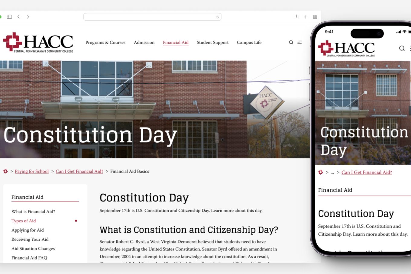
Case Study: HACC Website Redesign
Client: HACC: Central Pennsylvania’s Community College, Harrisburg, PA
Project Date: 2023
Objective: Enhance the user experience and modernize design templates to establish a flexible design system that caters to the evolving needs of HACC’s audiences.
The Challenge #
HACC’s staff recognized the outdated nature of their design and the frustration it caused among users. However, they lacked the expertise to execute a comprehensive project aimed at gathering user feedback and translating it into meaningful design changes. They requested methodologies to validate their assumptions, engage various internal stakeholders, and involve the community deeply.
Research Solutions #
Bravery faced the challenge head-on with our signature brand of research:
Sentiment Analysis: We gauged user emotions and identified aspects of the website that triggered positive or negative sentiments. This method uncovered usability issues and provided insights into user preferences and pain points.
Cognitive Interviews: We delved into user perceptions, allowing participants to articulate their thoughts and feelings while interacting with the website. This process revealed nuanced insights into the user interface design challenges.
Heuristic Evaluation: We conducted an evaluation involving experienced evaluators who assessed the website’s usability based on established principles. This evaluation identified 123 unique usability issues across content, design, and organization.
Terminology Review: We uncovered the language preferences of the target audience, informing recommendations for clearer communication and navigation on the website.

Design Solutions #
Our research findings informed every of the design process:
Foster Community Involvement: We presented three distinct design concepts to the HACC community for feedback and voting on the preferred design system and layout.
Address Complex Navigation: We provided three simplified navigation solutions, aiming to enhance user wayfinding and streamline access to essential information.
Alleviated Content Overwhelm: We structured pages with a narrative flow, emphasizing key information, and implementing a new type scale to enhance readability and content manageability.
UX Improvements: We prioritized user feedback through intuitive design choices and human-centric approaches.
The Outcome #
Bravery’s research and design resulted in an improved re-skin of HACC’s existing site. While not flashy by some standards, the design system will help website visitors more easily find the content they’re looking for.
Lessons Learned #
The project relied on Bravery collaborating with a large stakeholder group with many opinions. While we normally wouldn’t recommend a community vote on a website design, we also needed to be flexible in working with HACC’s specific brand of community engagement.
Wrapping Up #
The HACC website redesign project was not the most ideal structure, but it was what the college needed most. Our successful delivery of design templates opened the door for Bravery to conduct content strategy work for HACC’s major user journeys.
This case study demonstrates Bravery’s ability to manage relationships and show flexibility when collaborating with a wide range of stakeholders.