Case Study: University of Saint Francis Web Strategy
Client: University of Saint Francis, Fort Wayne, IN
Project Year: 2020-2023
Objective: A complete website overhaul, starting with research and content strategy.
The Challenge #
- They needed to establish brand positioning among new competitors and maintain and grow market share
- They needed a design system that supported how innovative, creative, and market-ready their programs were.
- They had a small, under-resourced web team
The Research #
Bravery conducted user experience and market research studies before and throughout the engagement. We started with a Web Strategy Guide featuring search engine optimization research, a content strategy audit, competitor analyses, a website performance audit, and user experience research. We performed focus groups, sentiment analyses, and several audience and market research studies during the engagement.

The Strategy #
In the redesign, we knew we’d need to implement a user-friendly content management system (CMS) with intuitive editing tools and workflows. We designed a site in WordPress, utilizing a block editor to empower their small team to craft meaningful experiences for their prospective students effortlessly.
An Intuitive Information Architecture: A complicated system of subdomains, separate sites, and non-standard terminology made finding the right content difficult. We overhauled the navigation and simplified labels to match better what visitors sought.
Improved Academic Program Content: We completely rewrote program content across the site to convey more information prospective students wanted while leading them to inquire or apply.
Logical Journeys: We tightened up user journeys across the website, focusing on increased conversions. We made sure all of the content had a purpose, leading users to take action.
Increased Site Speed: We optimized the website’s speed by building a custom WordPress theme and plugins and moving their website to managed hosting with a fast CDN. This has the effect of improving user experience, increasing conversion rates, and improving SEO rankings.
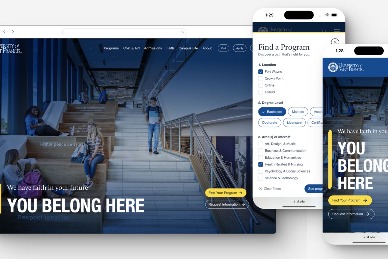
Modernized User Experience: We reinforced Saint Francis’ brand image by totally modernizing the site’s visual design and underlying UX.
Increase Applicants: We built a portable Program Finder that can be launched anywhere on the site. This, combined with our program page rewrite, increased applications and engagement.
The Outcome #
The www.sf.edu website is fast and optimized for better SEO and conversion rates. After reconfiguring the program pages and developing a new on-page content hierarchy, Saint Francis saw 100% increases in applications for focus programs.
Lessons Learned #
We were fortunate to work on this project over multiple years with plenty of effort put into getting things right. During this time it became evident that small teams need an intuitive CMS editing experience to maximize their effectiveness.
As we spoke with students and parents we realized that not everyone understands what the FAFSA is or how it works. Prospective students often saw it as all grants and aid, while parents saw it as a loan application. Neither are accurate and this highlights the need to more clearly explain financial information to our audiences.
w
Wrapping Up #
This case study exemplifies how Bravery’s long term partnerships with institutions can lead to the best performing websites in the industry. Our team cares deeply about producing work that makes a positive impact on higher education and its students. Flexibility was key in navigating an institution in transition, but the final website will provide meaningful change for the University of Saint Francis.